
Cannabis retail software founded in 2015. This guide should teach you how to use BLAZE assets properly.

Primary Dark against light background.

Primary Light against dark background.
Secondary Dark against light background.

Secondary Light against dark background.


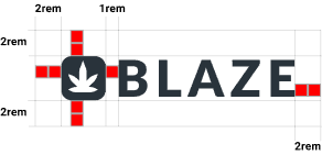
The space between the leaf bug (icon on the left of “BLAZE”) and the letter B = 1rem. We double that for the space around the entire logo. The trademark symbol should be treated as a floating element and should not be included when calculating spacing around the logo.
GOOD
BAD
Only use logos provided by BLAZE.
Never change the colors.

Make sure the registered mark is visible.

Never add effects like drop shadow or glow.
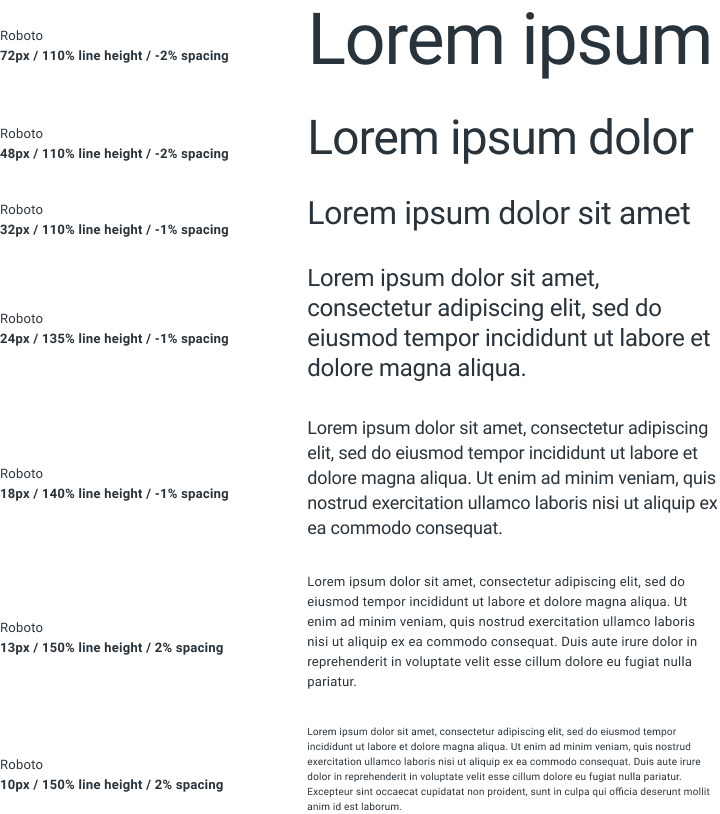
Vertical rhythm is essential to good typography; notice how the line height and the letter spacing increase as the font size decrease. This pattern applies to all font weights (regular, medium & bold).
BLAZE® is a leading cannabis software company providing cultivation, distribution, and retail point of sale services for thousands of businesses across the U.S. The BLAZE® software suite is currently available to licensed cannabis operators in Alaska, Arizona, California, Colorado, Illinois, Maine, Massachusetts, Michigan, Missouri, Nevada, New Mexico, New York, Oklahoma, Oregon, Vermont, and Washington.
BLAZE® is a registered trademark of BLAZE Solutions, Inc. All rights reserved. See our Terms of Service and Privacy Policy